Gaming app dark patterns are the interface choices that nudge you towards one more round, one more top-up or one more day of logging in. They are not accidents of layout; they are designed, tested against engagement numbers and kept because they work. This breakdown walks through the specific tricks that show up in colour prediction and betting apps, so you can tell the difference between your own decision and the screen making it for you.
What Are Dark Patterns in Apps?
A dark pattern is an interface built to serve the operator’s goals at the cost of yours. The screen is not lying outright; it is arranging colour, size, timing and wording so that the choice the operator prefers feels like the obvious one, and the choice you might prefer feels like extra work. Researchers increasingly use the plainer labels deceptive design or manipulative design.
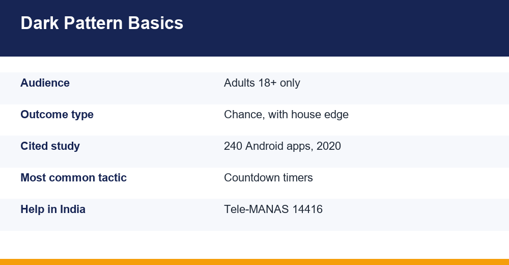
The term is widely used because the problem is widespread. A frequently cited 2020 study by Di Geronimo and colleagues examined 240 popular Android apps and reported that roughly 95% contained at least one dark pattern, with several types per app on average. The same work found that most participants did not recognise the patterns unless they had been told what to look for beforehand.
That last point matters more than the headline number. Dark patterns work mainly because they are invisible to anyone who has not been shown them. Once you can name a tactic, it stops feeling like a neutral part of the app. If the format itself is new to you, read what a colour prediction game actually is before judging the interface wrapped around it.
Researchers usually sort these designs into a handful of families:
- Interface interference – visual hierarchy that steers you to one button
- Nagging – repeated prompts that interrupt until you comply
- Forced action – a hoop you must jump through to get something unrelated
- Obstruction – making the unprofitable path (limits, exits, withdrawals) deliberately slow
- Sneaking – costs, conditions or conversions revealed late or not at all
- Social engineering – urgency, scarcity and other-people’s-wins framing
Gaming App Dark Patterns: Seven Tactics Broken Down
In chance-based apps the tactics cluster tightly, because the business problem is always the same: a round takes seconds, so the app must get you to start the next one before reflection sets in. Gaming app dark patterns in this space are therefore built around speed, repetition and the feeling of being mid-session rather than between sessions.
The table below is a quick reference. Each row is a pattern, what it tends to look like on screen, and the behaviour it is pushing. None of these is unique to one platform; they are generic design moves you will recognise across many apps once you start looking.
| Pattern | What it looks like on screen | What it nudges you to do |
|---|---|---|
| Countdown timer | Seconds ticking down before a round closes | Act before you have thought it through |
| Streak reward | A day 1-7 calendar that resets if you miss | Open the app every single day |
| Near-miss framing | Animation stressing how close the result was | Read a loss as almost a win |
| Fake urgency banner | Only 3 slots left, or offer ends soon | Skip comparison and hurry |
| Social proof feed | A scrolling list of other users’ wins | Believe winning is routine |
| Nagging prompts | Repeat push notifications and pop-ups | Return after you had stopped |
| Asymmetric friction | One-tap top-up, buried limits and exits | Stay funded and logged in |
Two framing points to hold on to while reading the rest. First, outcomes in these formats are chance events with a built-in house edge, which means no interface element can improve your expected result. Second, real money is at risk and these products are for adults 18 and over only. A clever interface does not change either fact – it only changes how often you engage with them.
How Countdown Timers Pressure Players Into Betting
The countdown is the single most effective pressure device in a fast-round app. A number falling from 30 to zero does two things at once: it sets a hard deadline, and it fills the gap where you would otherwise have thought. Consumer-research groups studying manufactured timers in games describe them as exploiting fear of missing out, and note that in many cases the reward behind the timer could have been shown without any countdown at all.
There are two distinct kinds, and it is worth separating them. A functional timer reflects something real – a round genuinely closes at a fixed moment. A manufactured timer is attached to something that was never time-limited, such as a welcome panel or a reload prompt that reappears with a fresh countdown every time you open the app.
The tell for a manufactured timer is simple: close the app, wait, and reopen it. If the same offer is back with the clock reset, the deadline was theatre. A genuine round schedule does not restart to suit your session.
Timers also compress the moment when terminology matters most. Wagering conditions, turnover requirements and bonus balances are exactly the things you cannot read in eight seconds, which is why it pays to learn the vocabulary in advance rather than mid-countdown. A plain-language run-through of the terms these apps use removes a lot of the advantage a timer has over you.
A practical counter-move is to decide your stop point before you open the app, not while a clock is running. Deadlines only work on people who are still deciding, which is why a number written down in advance is worth more than any amount of in-the-moment restraint.
Why Apps Hand Out Daily Login and Streak Rewards
Streak mechanics are the cheapest retention tool ever invented. Log in, collect a small bonus, keep the chain alive – and miss a single day and the chain resets to zero. Analysts of Indian mobile gaming describe exactly this loop, often sitting alongside pay-to-skip timers and premium currencies that blur what a round actually costs in rupees.
The mechanism is loss aversion. After eleven days, the thing you are protecting is no longer the day-twelve reward; it is the eleven days you have already banked. The app has converted your own past effort into a reason to return, and it costs the operator nothing to maintain.
Notice how rarely the streak reward is useful on its own. It is typically a small bonus credit that must be played through, a spin, or a token that only has value inside the app. You are not being paid for showing up; you are being given a reason to be standing in the shop.
Signs the streak is working on you rather than for you:
- You open the app on days you had no intention of playing
- Breaking the chain feels like a loss rather than a non-event
- You deposit to make the day count after collecting a free reward
- You can recall your streak length but not your month’s net spend
- A notification, not a decision, is what started your last session
The Clean Test for a Streak
The clean test is to deliberately miss one day and see what actually happens. Usually the answer is nothing of consequence, and the sunk-cost feeling evaporates within a week.
Are Near-Miss Animations Designed to Keep You Playing?
A near miss is a loss presented as nearly a win. In practice it means animation and sound doing work the result does not justify: a highlight sweeping past your choice, a number stopping one step away, a flourish that makes a zero-return round feel like a close contest. The design literature on gambling interfaces has discussed near-miss framing for decades, and it is one of the most consistently reported effects in that field.
The important part is statistical, not psychological. In a chance-based format, near misses carry no information. Being one shade off is not progress towards the next result, and it does not shorten any sequence. The underlying draw does not know or care what happened last round. Anything in the interface implying momentum is editorial, not mathematical.
Closely related is the loss-disguised-as-win pattern. Return a smaller amount than you staked and the app may still play the celebration animation, flash a green figure and add a sound cue. The number on screen is a return, not a profit, and plenty of people walk away from a session believing they were up because the app congratulated them often enough.
The antidote is arithmetic rather than vigilance. Track deposits and withdrawals in your banking app instead of relying on the in-app balance, and understand how outcomes are generated in the first place – how colour prediction results are produced makes clear why an animation cannot indicate a pattern.
Fake Urgency and Social Proof Banners Explained
Fake urgency is scarcity that was manufactured rather than observed. Only 3 slots remaining, last chance today, 2 users viewing this room – the claim is unverifiable by design, and it is usually generated rather than counted. The purpose is to shorten your decision window, because a hurried decision is a less careful one.
Social proof banners do the same job from the opposite direction. A ticker of other people’s wins scrolling up the screen creates an impression that winning is the normal outcome. Losses never scroll. You are seeing a curated feed, not a sample, and no feed of this kind tells you how many rounds were played to produce the entries shown.
Among gaming app dark patterns, these two are the easiest to catch once you test them. Reload the screen and watch whether the remaining-slots number resets. Watch whether the same usernames recur. Check whether any win amount is ever modest – real distributions are full of small results, invented ones rarely are.
A few specific red flags worth treating seriously:
- Win tickers with no timestamps, or amounts that are always round numbers
- Scarcity counters that reset on refresh or differ between devices
- Verified or certified badges that are images rather than links
- Prompts to move the conversation to a private messaging group
- Any claim of a guaranteed win, fixed prediction or paid tip service – chance outcomes with a house edge cannot be guaranteed by anyone, and such offers are a reliable marker of fraud
Describe what you see and judge it yourself. A banner being misleading is not the same as a platform being proven dishonest, but repeated manufactured urgency is a reasonable reason to stop.
Easy In, Hard Out: Friction Where It Hurts
The clearest signal of intent in any app is where it puts the friction. Compare how many taps it takes to add money against how many it takes to set a deposit limit, request a withdrawal, or delete your account. When one path is a single thumb movement and the other is buried three menus deep behind a support ticket, that asymmetry is the product design, not an oversight.
This family of patterns is called obstruction, and it shows up in recognisable forms. Limits placed under a sub-menu with a vague label. A cooling-off option that exists but is only described in a help article. A withdrawal flow that asks for documents the deposit flow never needed. A cancel-anytime claim where cancelling requires contacting an agent.
A related trick is the pre-ticked box. Marketing consent, auto-top-up, or notification permissions switched on by default, with the off switch styled in low-contrast grey. The default is doing the persuading; nobody had to argue for it.
There is also the reverse-friction prompt at the exit: a last-second pop-up offering a bonus precisely when you tap away. That offer appeared because you tried to leave, which is the most honest summary of what it is for.
Map the friction once, early, while you are calm. Find the limit settings and the withdrawal path on day one, before any money is involved. If you cannot find them at all, you have learned something useful about the app.
How to Spot Dark Patterns in an App: Checklist
Spotting gaming app dark patterns is a short, repeatable audit rather than a skill. Run it once when you install something, and again whenever an app’s layout changes after an update – updates are when new patterns usually arrive.
- Close and reopen. Any timer or scarcity counter that resets was manufactured.
- Count the taps. Deposit versus deposit limit, and deposit versus withdrawal. Note the gap.
- Read the defaults. Check every pre-ticked box and every permission granted at signup.
- Mute the theatre. Turn off sound and animation if the settings allow, then see whether the same round still feels urgent.
- Check the ledger, not the balance. Reconcile against your bank statement, never the in-app figure.
- Look for the off switch. Notifications, promotional emails, auto-top-up. If there is no off switch, that is the finding.
- Test one missed day. Skip the streak deliberately and observe how much was actually at stake.
Two Extra Fake-App Checks
Two extra checks belong to fake-app awareness rather than interface design, and both are worth a minute. Confirm you installed the app from the source you intended, not a link forwarded in a chat group, and be wary of any app requesting permissions unrelated to its function – contacts, SMS or screen recording have nothing to do with a round of play. Suspected financial fraud in India can be reported on the national helpline 1930 or at cybercrime.gov.in.
None of these steps improves your odds, because nothing can. They simply restore the gap between a prompt and your response, which is the only thing dark patterns are built to remove.
Staying in Control and Where Help Exists
Interface awareness is a defence, not a solution. The reason gaming app dark patterns are worth naming is that they shift where responsibility appears to sit: when design is driving the next round, advice to simply show more willpower is aimed at the wrong target. Setting conditions in advance works better than resisting prompts in the moment.
Practical measures that do not depend on the app cooperating:
- Decide a time and money ceiling before opening the app, and write it down
- Switch off all push notifications for the app at the operating-system level
- Remove the app from your home screen so opening it takes a deliberate search
- Keep a separate record of deposits and withdrawals outside the app
- Treat any session that starts because a notification arrived as a session you did not choose
- Avoid playing while tired, bored or upset, when manufactured urgency works best
If the pattern has moved past interface irritation – chasing losses, hiding spend from family, borrowing to continue, or playing to manage mood rather than for entertainment – support exists and asking for it early is ordinary. Talking to someone does not require a label or a diagnosis, and it does not have to start with the word gambling.
In India, Tele-MANAS runs a free, round-the-clock mental health helpline on 14416, operated under the Ministry of Health and Family Welfare with support in multiple languages; details are published on the Tele-MANAS national helpline site. It is a reasonable first call for stress, sleep problems or compulsive behaviour, whether or not you want to discuss gambling specifically.
Last point, plainly: these formats are chance with a built-in house edge, real money is at risk, and they are for adults 18 and over. A well-designed screen cannot change any of that – it can only change how long you look at it.
Frequently Asked Questions
What are dark patterns in apps?
Dark patterns are interface designs built to serve the operator’s goals at the user’s expense, using layout, colour, wording and timing to steer choices. A widely cited 2020 study of 240 popular Android apps found around 95% contained at least one, and that most users did not notice them unless they had been warned in advance.
How do countdown timers pressure players into betting?
A countdown sets a hard deadline and removes the pause where reflection would happen. Functional timers reflect a real round close; manufactured ones attach a fake deadline to offers that were never time-limited. The test is simple: close the app, wait, then reopen it. If the clock resets, the urgency was staged.
Why do gaming apps give daily login and streak rewards?
Streaks exploit loss aversion. After a few days the thing you protect is the chain itself, not the small reward, so the app turns your own past effort into a reason to return. Rewards are usually in-app credit with conditions attached. Missing one day deliberately usually shows how little was really at stake.
Are near-miss animations designed to keep you playing?
Near-miss framing presents a loss as almost a win through animation and sound, and gambling design research has discussed the effect for decades. Statistically it carries no information: in chance formats, being one step away is not progress and does not shorten any sequence. Any suggestion of momentum is presentation, not mathematics.